Monthly Archives: October 2013

Overcoming the problems of typeset calligraphy

A recent article on I Love Typography details a case study about confronting the troubles that accompany transposing traditional calligraphic forms to a computer typeface.

The author says that he was always dissatisfied with Arabic type—in a storybook clash of East versus West, early Arabic typefaces attempted to wrest round Arabic pegs into square Latin holes.

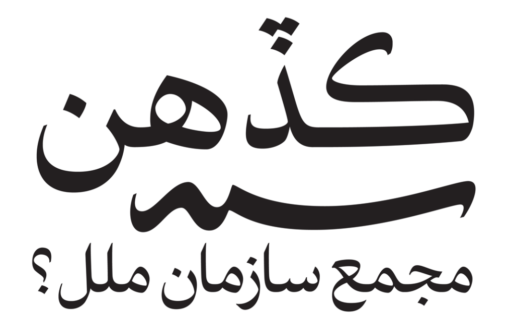
One issue, for example, is the management of negative space: In writing, calligraphers can produce an even gray—that is, an even distribution of black (ink) and white (paper)—which is done by modulating the width and shape of each letter and the placement of diacritics in response to every unique environment. In type, this high variability is given up, as we’ve discussed before, at a high cost in aesthetics and readability.

The author elaborates:

Using OpenType to create a conventional Arabic text typeface with balanced white space is nearly impossible due to the fact that the correct positioning of the dots is determined by the word shapes, not the letter shapes. Furthermore, elements of the letter shapes (such as the horizontal position of the baseline and the structures of the connections between letters) are also dynamic, tied to the shape of each word and the surrounding words as well. Thus redesigning the letters to make the white space beautiful presents a significant challenge.

In response to these challenges, the author has created a new Arabic typeface that is both more beautiful and more readable. He outlines many considerations (with great, large illustrations) in the original article.

And he doesn’t stop at just creating a better Arabic script. Chronicling a stroke of cross-cultural aesthetic genius, he explains:

A world of global communications demands fonts that support multiple languages and scripts. After Bahman Eslami completed Harir, Peter Biľak developed a special version of Lavato serve as Harir’s Latin character set, perfectly matching its weight, rhythm and contrast. Designers of non-Latin typefaces are often forced to adapt Latin design principles when they want their fonts to work well in multilingual settings. This can result in distorted letter shapes that deviate from the script’s tradition and heritage, impairing readability. Harir and Lava provide a unique combination that enables professional-quality multilingual (Arabic, Latin, Greek and Cyrillic) typesetting with no compromises.

Neography ain’t new

The name neography implies that it refers to a new (neo-) form of writing (-graphy). But the truth is that this is a misnomer: Neography is nothing new. In fact, it’s as old as writing itself.

Mateo Maciá writes in his study on written language that the first Greek writings exhibited tremendous freedom in form, focusing as much on the graphic value of each letter as the phonetic value. Early Greek writers wrote indiscriminately from left to right, from right to left and in bustrophedon, in which a string of characters advances down the page in a zig-zag pattern, with each line alternating between left-to-right and right-to-left. You can read more about this in a recent article on Lexicon Valley that is, in itself, an excerpt of a recent book on written language by Keith Houston.

In time written language saw some standardization (with regard to direction, for example), but each individual writer still had a lot of freedom of visual expression. As I’ve written about before, there are uncountable ways to write each letter, and we each develop our own, unique handwriting scripts as we scribble our way through life.

But when the printing press came along, it squelched this type of individual paragraphemic expression. As Amalia Gnanadesikan writes in The Writing Revolution:

Different people have different handwriting … Individual Mycenaean or Carolingian scribes can still be identified by their work; not so the modern writer. With a single font, the e in one word will look just like the e in the next, no matter who originally authored the individual words. …

Inevitably, there were some who objected to the sterility of the new process. How could the spiritual value of a printed Bible possibly compare to that of one crafted by hand by a praying human soul?

If today’s neography is an attempt to recoup the personality lost in the transition to type, are we seeing a return to the writing of oral culture? In his book, Maciá lists a number of ways that our current writing culture reflects that of before the invention of the printing press:

  • Concept of scroll (which reminds us of scrolls that were around before modern pages)
  • Predominance of copulative sentences instead of subordinations
  • Fixed formulas that are no longer analyzed for their literal meaning (lol, for example)
  • Integration of text and images
  • Homeostasis (dictionaries are consulted less in neographic writing, meaning that words are defined in running context)
  • Multilingualism
  • Change of support (whereas typography has only occurred on paper, other writing has used a myriad of supports)
  • Rewriteability
  • Proliferation of audiovisual communities along with textual communities
  • Predominance of orality in public communication
  • Mobility of information
  • Public (rather than individual) storage of information
  • Lacking policies of control and governance (innovations can surface anywhere)

Clearly we have readopted many aspects of oral culture. But we don’t truly have an oral culture. Our laws are still written, for example, and written contracts are final. And, after all, though our writing does encroach upon speech, it is inarguably still written. So where does that leave us? We’ve got a print culture with many aspects of oral culture—amidst a heterogeneous culture clash.