I recently began learning Japanese, and I was struck by how some of the kana look like Latin letters. ん, for example, looks like h. な looks like tj. ケ looks like k. These are just coincidences, of course; Japanese characters have nothing to do with Latin letters. And on their own, maybe these examples aren’t that exciting. But when I considered ナ, it got more interesting: ナ looks a little bit like a t, but only if you’re looking for resemblances. If you just saw it on its own, it’s unlikely that you’d think it’s a t. Why? Probably because the vertical line slants in the wrong direction, and the horizontal line is a bit too long.
What makes each letter each letter? What is it about one collection of strokes that makes us think A, while another does nothing of the sort?
Here we get into Prototype Theory, a storied branch of philosophy that overlaps a lot with linguistic semantics. Imagine you were trying to explain to someone what bird means by showing them a picture. Would it be more helpful to show them a robin or an ostrich? If you’re a Westerner, you probably said a robin. That’s because, for some reason, a robin is much more birdish than an ostrich. That is, a robin exhibits more of the characteristics that we consider prototypical of birds, while an ostrich is more of an outlier.
In the context of letterforms, we can suppose that we have a learned sense of the prototypical characteristics of each letter. But no one writes like Helvetica; indeed, our handwritten letterforms vary wildly: We can put a tail on our U or happily leave it off; we can put a cap on our J; and we can round our E, V and W with no negative repercussions. Interestingly, in some cases the handwritten form greatly differs from the typed form. The lowercase a is a good example: Almost no one writes it with the upper stem (as seen in the non-italic a), but that’s the most common typed form. When we see the two-story a handwritten, it gives us pause.
The question is: How many of these prototypical letterform characteristics can we pluck away before our letters become unidentifiable? And how do we learn these characteristics in the first place?
I think generally the distance we can stray from the prototype has to do with whether the modified version could be confused with another letter. It won’t matter if the stems of your N are crooked. It’ll still be legible. If the vertical line of your E is a bit too long, it’s no big deal. But if you make the line too long on your L, it might look like a t. And if you hurriedly write H, it might look like it. If you round your M, it’s fine, but if you round your D too much it might look like an O. An upside down E is still an E, and somehow an upside down A is still recognizable as an A. But an upside down M reads as a W. How tall can the stem on an n be before it becomes an h?
But the rules don’t always have to do with confusion with other letters; sometimes the rules are simply in place so we can see that a given form is, indeed, a letter, and what letter it is, without delay. For example, I’ve found that my lowercase f is sometimes unrecognized by others. It’s not that they think it’s a different letter, but rather that they don’t know what it is.
Where does our knowledge of these prototypical characteristics come from? Simply put, we logically induce the rules from seeing letterform after letterform throughout our lives.
Besides pure input, we can learn from explicit feedback. As children, we might have written P backwards. It wasn’t possible to confuse ꟼ with another letter, and it was certainly still recognizable as P, but our teacher would still have said it was wrong and corrected us. In some cases, we might have mixed up d and b, but eventually we would have realized (either by explicit feedback or through our own realization) that these create ambiguities.
It gets interesting when we learn new scripts, which come with a whole nother set of rules to learn. Intuitively we’ll want to apply some of our native script–specific rules to the new script. For example, Japanese publishers print Western numerals as monospace characters, where each character takes the same amount of horizontal space, because all native Japanese characters are monospace. Compare 100 and 100. The first one looks normal to us because the 1 takes up less space than the wider 0‘s. But the second would look more normal to a Japanese person, because each character has the same width.
But we have to be careful. When I write in English, I know that I can loop the tail on my j and g and it won’t affect readability. I also know that I can wait to cross my t‘s until the very end of the word, when I can elegantly get them all with a single stroke that comes off the last letter. But when I’m writing in Japanese, I don’t know what modifications I can do without causing problems.
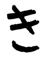
When I was starting out with hiragana, I wrote き exactly as it appears typed. But I soon learned that no one actually handwrites it that way; proficient writers disconnect the bottom curve from the vertical line, like this:
Of course, handwriting き as it appears on the computer isn’t detrimental; it’s just amateurish. But the point is that I have no idea which mistakes I may be unwittingly making that are detrimental.
In learning a new script, we have to learn what characteristics matter most. It begins with direction: in English, all characters have the same height (ascenders and descenders notwithstanding). In Japanese, all characters fit into a square, with width uniformity apparently being the priority; the language was traditionally written vertically.
Even within a single script, it seems there are cultural variables—something not mentioned in language classes. Most Europeans, for example, write the number 1 with a long tail and no base, almost like a ʌ. A lesser-known example is the cursive lowercase z. Below is the one I learned in school on the left, along with the one most commonly used in Poland on the right (probably not 100 percent accurate, since it’s my imitation :)).
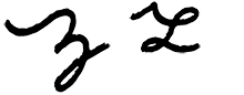
There’s a good chance that if you wrote a cursive z and asked a Pole what it was, they wouldn’t have a clue. (We, on the other hand, are a bit luckier, given that the cursive Polish z more closely resembles a regular z.) I was also pleased to discover that the Spanish tend to write their lowercase f just as I do—a way that proved unrecognizable to many of my fellow Americans. If you’re somehow as interested in all this as I am, check out the Wikipedia article on regional handwriting variation.
So what’s the point? From here, we could go through every script in the world and each character in each script, defining all the possible acceptable variations and analyzing them. Maybe I will someday, but not now. For the moment, let this meditation suffice to give a perhaps newfound appreciation for how well you know the Latin script—and what went into getting you to where you are. The fact is that we know this script mind-bogglingly well—to the point where we can spot when others aren’t so fluent—given away by an awkward stem here, a crooked form there—even if we’re not actually aware of this ability.