Writing in the Roman alphabet, as we do in English, is a major privilege when it comes to communicating online. If your language doesn’t use it, you will face some serious challenges, to say the least.
That’s why I was so delighted to hear about Phoreus Cherokee, a new and quite complete typeface for the Cherokee language.
Recently the Cherokee recognized that, in order for their language to survive, it needed to get online. The Cherokee lobbied Apple to include support for their language, and they were successful. But there was still an issue, visually: Because it was historically underprivileged, the language never got to flourish artistically, as other languages did. They only had two typefaces, and they were limited. “Many of the glyphs weren’t accurate or were completely wrong,” according to Roy Boney, a Cherokee language services manager (quoted in the article linked above).
Enter type designer Mark Jamra, who tasked himself with creating a complete typeface of the Cherokee syllabary. Watch the video below for more.
One fascinating part about this story is that Jamra doesn’t speak Cherokee, and he only became familiar with the writing system through this project. He studied historical documents in order to uncover the “essence” of each of the letters. In this way, as he says in the video above, “I wouldn’t just be channeling the one-off quirks of some writer in, say, 1853, but rather I’d be basing them on forms that anyone could read who could read Cherokee.” Brilliant.
The story and video mostly focus on Jamra’s innovation in creating an italic version of the script, as well as lowercase glyphs. Now, this is quite interesting. At first, the creation of these glyphs seems unequivocally good: After all, more = better.
But not all languages have upper and lower case, and not all use italics (and bolding). These are conventions of the Roman alphabet as it’s evolved over time, and I can’t help but think it’s colonial, presumptuous, etc., to assume that all languages ought to have them.
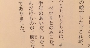
Take Japanese, for instance. There’s now upper/lowercase distinction in Japanese, and there’s no italic or bold. A number of conventions have developed instead. To give a quote or title, the Japanese would use half-brackets, 「like this」. For emphasis, they would either alternate syllabaries (the language has two syllabaries that are used in concert), or use “emphasis points” (called bōten or wakiten) along the characters to be emphasized. This can be seen in the image below, a photograph from my copy of 星の王子さま (a.k.a. The Little Prince), where the characters けもの (beast) are being emphasized.
All this is to say that different languages have different needs and have developed different ways to show paralinguistic distinctions. How we do things in our alphabet is not the only way! In a world where more and more languages are adopting the Roman alphabet, we should celebrate diversity where we still have it, shouldn’t we?
(Or maybe the real lesson here is that I have a bone to pick with everything!)
 Follow

