Just as written text can be indexical, it can also be iconic. For example, a handwritten extract in a novel can be iconic in its capacity to convey the mental state of its writer at the moment of writing it. Similarly, the use of italics and capital letters can be iconic in that they represent a nuanced pronunciation.
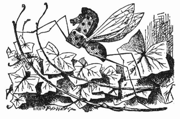
The iconic capacity of the written word has its basis in metaphor. Just as the expression time is money demonstrates a mental association between the concepts of time and money, similar associations can be demonstrated by visual metaphors in written language; we tend to associate, for example, letter size with volume. Lewis Carroll famously took advantage of this with the beetle character in Through the Looking-Glass: The creature’s tiny voice is rendered in correspondingly tiny type.

Though the relationship between type size and spoken volume might be universal, Alexandra Jaffe warns that such paragraphemic iconicity may not always be so: “Becoming literate is not just the acquisition of orthographic decoding skills, but also involves the development of a (culturally conditioned) graphic sensibility.” In truth, all aspects of communication—as an endeavor that depends on symbolic, indexical and iconic associations in itself—depend on the cultural background of both interlocutors.
The same apparently goes for communication online: In a study on the localization of Wikipedia pages, the researchers concluded that the Web is, to some extent, culturally determined. They found diverse cultural markers that differentiated the appearance, organization and particular content of different localized websites. “Members of different cultural groups,” they say, “prefer different icons, colors, and site structures.”
 Follow


It seems to me that the whole icon, index, symbol triad has long outlived its usefulness. Labeling the phenomena you describe with them is more confusing than helpful. First, pretty much everything about writing is symbolic. Small print print may be associated with a ‘tiny’ voice and ALL CAPS shouting. But all those associations are conventions, not natural. When ALL CAPS are a design feature, nobody associates them with shouting. Terry Pratchett’s Death SPEAKS LIKE THIS but it’s not shouting but has a booming voice. How do we know that? He tells us. Convention par excellence.
There’s a certain amount of iconicity in the connection between volume of voice and size of text but that in itself is dependent on an entirely symbolic understanding of all the constituent elements.
The whole process of meaning making is far too complex to be reduced to a tripartite semiotic taxonomy – which is why I don’t believe using the jargon does anything of much use. The description of what’s going on can stand on its own without a layer with highly dubious theoretical foundations.