Yesterday Apple released iOS 8.3. Along with performance fixes, this update includes a dramatic (and long-awaited) redesign to the emoji keyboard.
I love emoticons. Originally a simple way to relay facial expressions in text, they’ve become words in their own right. Emoticons are a way for users to express creativity and nuance. Emoji has widened our emoticon lexicon even further: Was there ever another time in history when a drawing of a smiling pile of poop or a girl lifting her hair meant something so nuanced?
The release of new emoji is always exciting. How did we ever live without the tears-of-laughter face? New emoji offer new possibilities for our e-language of texting and tweeting, new crevices in which to carve nuance. But this update has me extremely disappointed. It’s a giant leap backwards for mankind. And yes, it’s that serious.
So what changed? Well, first there’s the interface. If there’s anything good about this update, it’s this. The new interface makes it faster and easier to find and use emoji. There’s also a new hand gesture (Live Long and Prosper!), several new flags, and a number of new combinations of “families” (groups of three or four people). All that’s fine. But then we have the really troubling thing: what is misleadingly called diversity, which really means skin-color diversity, because apparently diversity is only skin-deep.
Okay, elephant in the room: I am a middle-class white male. As such, you might be inclined to find my viewpoint bigoted and misinformed. That’s a topic for another venue. For now, hear me out.
In 2014 Unicode recommended changes to the emoji library that included visual ethnic diversity in the drawings of tiny people. They wrote in their report, “People all over the world want to have emoji that reflect more human diversity, especially for skin tone” (Section 2.2). It seems that this really is the case, and it came into the limelight in online petitions as early as 2013. If there is a desire in the marketplace, it only makes sense for a company to respond in its offerings. If people want diversity in their emoji, then I’m all for it. But it has to be done right. And here, Apple did not do it right.
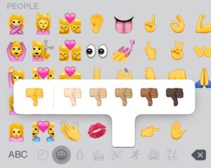
Here’s how it works in Apple’s new emoji keyboard: You tap on a character. If it is eligible for choice in skin tone, a context menu pops up, and you now decide whether to choose bright yellow or from a range of five human-looking skin tones (going from pale to dark). When you tap one of these six, your selected emoji appears.
Now let’s take a step back in order to understand what’s so wrong here. In language, there are distinctions. If there were no distinctions, then our speech would just be an endless stream of monotone: aaaaaaaaaaah. Obviously, we couldn’t extract much meaning from that. It’s the distinctions that determine meaning. K sounds different from G and that’s how we understand the difference between cool and ghoul. Different languages make different distinctions. In English, for example, we make two different L sounds. The L in animal and the L in lamp are different, but we don’t distinguish between them and thus they sound the same to our ears—yet in other languages of the world, these are as different as our K and G. Another example is tone: In Mandarin, for instance, tone can distinguish one word from an otherwise-identical one; this isn’t the case in English.
The way Apple implemented racial diversity, now race means something in our language. Skin color is now a meaningful distinction. And we have no choice. There’s no opt-out. Every time we use an emoji, we must discuss race. If you choose the yellow guy, you’re saying, “Hey, I don’t mean a particular race when I’m saying this.” That choice in itself has symbolic ramifications. On the other hand, if you choose a particular human skin tone, it begs the question: Why that one? In our new world, race becomes a differentiator in our language. And the only way we can opt out is by not using emoji at all.
First of all, is yellow really raceless? In my view, at least, it is just the cartoon version of white. Think of The Simpsons. In that show (and it has been extremely influential), all white people are bright yellow (like these new emoji). If a person in the show is not white (like the Indian convenience store owner), they are drawn in a different color. Other people, it seems, have interpreted the yellow emoji as supposed-to-be-Asian.
And then there’s aesthetics. The yellow-colored emoji are, in a word, hideous. Before, though they were admittedly mostly Caucasian, the emoji were designed nicely. The colors were harmonious. Given the skin tone used, the people’s hair and accessories were colored in a complementary way. Though ostensibly racist, they were visually pleasing. Now, though, Apple seemingly just made the skin bright yellow without adjusting anything else (or if they did, they didn’t do enough). Bright yellow skin begs brighter accessories. But as of now, everything just looks ugly and washed out. I thought Apple was supposed to be the paragon of great design. Maybe they’re so busy working on their Watch that they had to have the janitors do these emoji. (For the record, I’m not the only one who thinks they’re ugly.)
To speak of usability, now it takes two taps to choose a character, whereas before it only took one. It takes longer. But not only that: Now there’s an extra decision involved. Do we really want to contribute to our decision fatigue for something so trivial?
Next, once we decide to implement race, it opens up a whole can of worms. In the new emoji keyboard, race is only an option on some of the characters. Why not all of them? Why can’t I have two dancing bunny-costume girls who happen to be black? Why are the smily faces still only available in yellow? On that note, why don’t we get different color animals? Why can’t I have a brown bunny? Or a purple fish?
I do get it. Before there were mostly white people. There was an Asian in a guan pi mao cap, and there was a Middle Eastern–looking man in a turban. There were no black people. I get it. Not everyone was equally represented, and the representations that were there could be construed as stereotypical caricatures. People in these un(der)-represented groups must have felt, well, un(der)-represented. Should there be racial diversity in emoji? Sure. Was this the way to do it? Absolutely not.
What are some better solutions? Below are three I came up with off the top of my head. I’m sure if I dedicated two years or more to this, as Apple has done, I could think of even more.
- Assuming bright yellow is the default, that should appear on tapping. If someone wants to select a race, they can hold down the character and choose—just like with diacritics on the text keyboard.
- Maybe a setting somewhere to choose your default emoji skin color, and that’s the one you use. (Perhaps having the option of holding down and selecting a different color if you want.) This seems to be the thinking behind Africa-based emoji company Oju Africa‘s emoticon set, which is quickly becoming popular.
- Do the emoji need to be colored at all? Perhaps not. Could they just be transparent? Or, if we want color, why not use non-realistic colors, such as green and purple, as we see in Google Chat? Either way, this would remove the variable of skin tone.
Alpesh Patel, CEO of Oju Africa, mentioned above, had this to say about Apple’s latest release:
Look at their new emoticons—it’s all about skin colour. Diversity is not about skin colour—it’s about embracing the multiple cultures out there that have no digital representation.
If we really want to celebrate and respect diversity, making race into a meaningful distinction in our language is absolutely not the answer. By definition, highlighting our visual differences like this will drive us apart. Shouldn’t we, instead, strive to see ourselves as all part of a singular, multifaceted human community? Can’t we realize—please—that there is much more to diversity than skin color?
Why are we so obsessed with skin color? It looks like Dr. King taught us nothing after all. How many more people have to die for us to realize this?