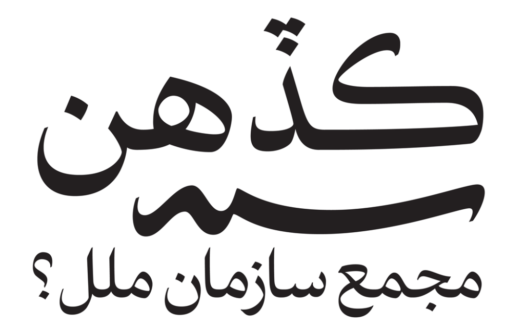
A recent article on I Love Typography details a case study about confronting the troubles that accompany transposing traditional calligraphic forms to a computer typeface.
The author says that he was always dissatisfied with Arabic type—in a storybook clash of East versus West, early Arabic typefaces attempted to wrest round Arabic pegs into square Latin holes.
One issue, for example, is the management of negative space: In writing, calligraphers can produce an even gray—that is, an even distribution of black (ink) and white (paper)—which is done by modulating the width and shape of each letter and the placement of diacritics in response to every unique environment. In type, this high variability is given up, as we’ve discussed before, at a high cost in aesthetics and readability.
The author elaborates:
Using OpenType to create a conventional Arabic text typeface with balanced white space is nearly impossible due to the fact that the correct positioning of the dots is determined by the word shapes, not the letter shapes. Furthermore, elements of the letter shapes (such as the horizontal position of the baseline and the structures of the connections between letters) are also dynamic, tied to the shape of each word and the surrounding words as well. Thus redesigning the letters to make the white space beautiful presents a significant challenge.
In response to these challenges, the author has created a new Arabic typeface that is both more beautiful and more readable. He outlines many considerations (with great, large illustrations) in the original article.
And he doesn’t stop at just creating a better Arabic script. Chronicling a stroke of cross-cultural aesthetic genius, he explains:
A world of global communications demands fonts that support multiple languages and scripts. After Bahman Eslami completed Harir, Peter Biľak developed a special version of Lavato serve as Harir’s Latin character set, perfectly matching its weight, rhythm and contrast. Designers of non-Latin typefaces are often forced to adapt Latin design principles when they want their fonts to work well in multilingual settings. This can result in distorted letter shapes that deviate from the script’s tradition and heritage, impairing readability. Harir and Lava provide a unique combination that enables professional-quality multilingual (Arabic, Latin, Greek and Cyrillic) typesetting with no compromises.
