Category Archives: Handwriting

Immortalizing the world’s endangered alphabets

There’s a great hubbub among linguists—though (regrettably) not among the world at large—about the thousands of languages that are slated to evaporate over the coming decades as small languages with few speakers give way to the few politically strong languages of the world. Losing languages means losing cultural heritage: history, mythology, perspectives. If you’d like to learn more, I suggest checking out the Endangered Languages Project, which seeks to document as many of these languages as possible before it’s too late.

As regular readers of ScratchTap (or afternoon thinkers on the matter) surely know, languages does not equal writing, though it is easy to mistake them as one and the same. Thus, even the linguists who fret over the disappearance of languages seldom consider the disappearance of the writing systems used to encode those languages. Such a loss is just as grave.

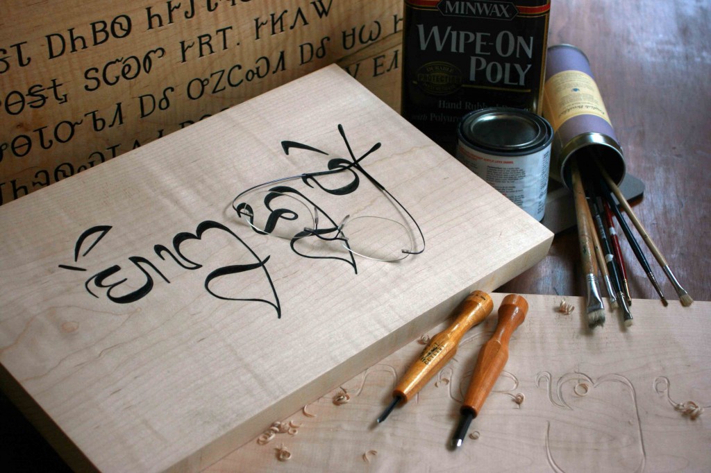
I recently found out about a new project by Tim Brookes called Endangered Alphabets, a traveling exhibition and philosophy dedicated to this issue. The project’s home page summarizes its mission nicely:

Writing has become so dominated by a small number of global cultures that those 6,000-7,000 languages are written in fewer than 100 alphabets. Moreover, at least a third of the world’s remaining alphabets are endangered–-no longer taught in schools, no longer used for commerce or government, understood only by a few elders, restricted to a few monasteries or used only in ceremonial documents, magic spells, or secret love letters.

The Endangered Alphabets Project, which consists of an exhibition of carvings and a book, is the first-ever attempt to bring attention to this issue–and to do so by creating unforgettable, enigmatic artwork.

The Endangered Alphabets are not only a unique and vivid way of demonstrating the issue of disappearing languages and the global loss of cultural diversity, they are also remarkable and thought-provoking pieces of art. These two threads interweave to raise all kinds of questions about writing itself: how it developed, how it spread across the globe, how the same alphabet took on radically different forms, like Darwin’s finches, on neighboring islands, and how developments in technology affected writing, and vice versa.

Without further ado, check out the Endangered Alphabets website. You can see pieces from the exhibition, learn more about the project, and even purchase a piece of art for yourself. (Tim does commissions!)

I’m a big fan of bringing issues to light in multiple ways. Sure, we have scholars writing books on the disappearance of writing systems, but those can only reach so many. This project will reach a different audience. In the future, I hope there will be other projects that will reach even more.

Creating versus selecting: A shift in expression—and cognition?

The use of type not only revolutionized the scale of book production, but marked a significant conceptual change in the way writing was done. The original process of writing by the creation of letters became a process of writing by selection from a preformed set of letters. The human hand creates infinite variety. Different people have different handwriting, and even an individual’s handwriting will vary from one writing session to the next according to mood, fatigue level, posture, etc. Movable type changes all that. Individual Mycenaean or Carolingian scribes can be still identified by their work; not so the modern writer. Within a single font, the e in one word will look just like the e in the next, no matter who originally authored the individual words. How many people’s words, for example, have been uniformly recorded in Times New Roman type?

Inevitably, there were some who objected to the sterility of the new process. How could the spiritual value of a printed Bible possibly compare to that of one crafted by hand by a praying human soul? Equally inevitably, perhaps, the new technology won the day. The invention of movable type by no means halted to the activity of handwriting, but it did mean that most public texts thereafter were written by selection rather than by creation. At first the privileged domain of print shops, writing by selection has only become more dominant with the invention and widespread use first of typewriters and then of personal computers.

From The Writing Revolution, by Amalia Gnanadesikan

I came across this passage while researching for my thesis, and I haven’t been able to stop thinking about it: The idea here calls into question our very perception of creativity.

After all, we think of choosing among the different typefaces our computers offer as exercising our creativity, but it is really merely selection from the choices that the computer has to offer. Very few of us go to the lengths of designing our own typefaces, and I’m not sure anyone has done so for something like an essay.

For another example, let’s consider the place of handwriting in our society today. First, it’s not taught in schools anymore, possibly because of computers. My generation, for example, has horrible handwriting according to yesterday’s standards, probably because we type more than we write by hand.

How many other aspects of our lives has this touched? Certainly it goes beyond word processing. There are a million examples: Nowadays we’d rather choose between two flavors than create our own. We’d rather select from a list of topics for an essay than come up with our own. Art students invariably find it easier to work when they’re given some parameters rather than free reign over what they create. Teachers select from rather than create their own materials. Could the Enlightenment—the shift from alchemical to empirical science—also be a product of this movement? (And the worst part of it is, if we’re presented with too many choices, we find ourselves paralyzed. An excellent book on the subject is The Paradox of Choice by Barry Schwartz.)

I know I said “merely selection” above, as if selection were a bad thing. But is it? Certainly if we frame the question as choosing between coming up with our own ideas (creating) and stealing others’ ideas (selecting), then we’d probably say creating is nobler. But I don’t think it has to be. For instance, selection allows us as a society to focus our attention in different places. If we had to spend all our time designing typefaces or even just writing things our by hand, we wouldn’t be able to devote our thoughts to other things. (Though there are some who’d say that by speedily typing up our thoughts, we fail to think them through completely.)

And contrary to what Gnanadesikan says, writers must have selected to some degree before the printing press came along. Though the exact shape of the letter might vary from one instance to the next, it had to be recognizable. If I were a medieval monk transcribing Bible pages, for example, and I decided to replace the letter with a pictogram of a little zebra—and for good measure, sometimes I’d make it a lion or giraffe instead—I’d truly be creating. But people would have a harder time reading what I’d written.

Does that mean, then, that communication must be an act of selection in order to be successful? We do, after all, have to be familiar with the codes that our interlocutors are using or we won’t be able to decode their messages. We can’t invent words willy-nilly or transcribe our speech into senseless strings of characters if we want to be understood. The conclusion: Movable type and our modern propensity for selection, rather than creation, has aided the communication process. After all, in a communication system, consistency is a boon.

But what has this done to us outside communication? In art, for example? It’s an oft-asked question: Do artists or thinkers truly create, or do they select from things they’ve seen and heard? In other words: Are they creations, or permutations? If we really are only rehashing old ideas, is it possible that we actually created before the invention of the press? (It’s an intriguing idea; after all, around the same time that the press debuted, our artists returned their focus to Antiquity with the Renaissance.)

Is innovation truly possible? Did the invention of type change anything? Is selection inherently good or bad? Can we channel our creative roots by returning to handwriting?

Overcoming the problems of typeset calligraphy

A recent article on I Love Typography details a case study about confronting the troubles that accompany transposing traditional calligraphic forms to a computer typeface.

The author says that he was always dissatisfied with Arabic type—in a storybook clash of East versus West, early Arabic typefaces attempted to wrest round Arabic pegs into square Latin holes.

One issue, for example, is the management of negative space: In writing, calligraphers can produce an even gray—that is, an even distribution of black (ink) and white (paper)—which is done by modulating the width and shape of each letter and the placement of diacritics in response to every unique environment. In type, this high variability is given up, as we’ve discussed before, at a high cost in aesthetics and readability.

The author elaborates:

Using OpenType to create a conventional Arabic text typeface with balanced white space is nearly impossible due to the fact that the correct positioning of the dots is determined by the word shapes, not the letter shapes. Furthermore, elements of the letter shapes (such as the horizontal position of the baseline and the structures of the connections between letters) are also dynamic, tied to the shape of each word and the surrounding words as well. Thus redesigning the letters to make the white space beautiful presents a significant challenge.

In response to these challenges, the author has created a new Arabic typeface that is both more beautiful and more readable. He outlines many considerations (with great, large illustrations) in the original article.

And he doesn’t stop at just creating a better Arabic script. Chronicling a stroke of cross-cultural aesthetic genius, he explains:

A world of global communications demands fonts that support multiple languages and scripts. After Bahman Eslami completed Harir, Peter Biľak developed a special version of Lavato serve as Harir’s Latin character set, perfectly matching its weight, rhythm and contrast. Designers of non-Latin typefaces are often forced to adapt Latin design principles when they want their fonts to work well in multilingual settings. This can result in distorted letter shapes that deviate from the script’s tradition and heritage, impairing readability. Harir and Lava provide a unique combination that enables professional-quality multilingual (Arabic, Latin, Greek and Cyrillic) typesetting with no compromises.