Category Archives: Technology

“It’s handwritten, but not by me!”

Ah, the personal touch of a handwritten note.

Ever since the dawn of type, people have been talking about how special handwriting is. In type, the English alphabet has only 26 letters (make that 52, counting lowercase and capitalized forms), but in handwriting, there are infinite letters. Just think of all the ways you can write the letter g and have it still be recognizable. (Indeed there is an entire blog dedicated to this letterform.) When we read something handwritten, we get a sense of the personality and emotion of the writer. This is why, when printed Bibles came along, people found the words a bit lacking in spirit. And it’s why handwritten letters are so special for us, even today (if a bit sloppier).

With digital technology, we’re no longer limited to keyboards and mice for input. With trackpads and touch screens, we can combine some of the personality of handwriting with the capability of electronics. The latest update to Apple’s iOS on the iPhone and iPad takes advantage of this, giving people the opportunity to send handwritten and drawn messages. Recipients can even replay the drawing to see how it came to be.

iOS 10 handwriting feature

While exploring this feature, I was struck by what seems to be an absurdity: It comes loaded with a number of pre-written messages—hello, thank you, happy birthday, etc.—that you can simply tap and send. That is, you can send a handwritten message without actually having to write it. I guess I shouldn’t be surprised—it turns out ghostwriting love letters is a sustainable business (and I feel like it figured in the plot of a novel I read once, but I can’t remember what it was).

Still, this seems tremendously weird to me. Wouldn’t a recipient find it disingenuous to receive the exact same text again and again? Though, then again, will people actually use these pre-made messages? For now, all I can do is speculate.
 

Document power

It’s becoming harder and harder to ignore how documents exert influence on us—in politics, across society and in everyday life.

Examples are easy to find. A recent paper in the Journal of Documentation discussed how, in South Africa under Apartheid, documents were used to impose racial categories on individuals, which resonates with today’s discussions around legal gender. Library and information science professor Ron Day’s book Indexing It All discusses how social media and other big-data apparatuses exert similar control.

But the power of documents is nothing new. Indeed, I suspect it’s as old as writing itself. Or even older. I can only imagine the power wrought by the earliest smears of red ochre on burial sites 100,000 years ago. Of course, political control—especially when unbeknownst—is much graver than the kind of power of spiritual awe.

An interesting example of the use of written documents to impose political power is given by Bhavani Raman in the book Document Raj: Writing and Scribes in Early Colonial South India, based on her doctoral dissertation. Her account shows how the machinery built around written records far exceeded the power of military might in the 18th-century English colonization of Madras. The pen is mightier than the sword, indeed. And beyond the manipulative bureaucracy that was constructed around written records themselves, issues around language choice and translation are also wrapped up in the story. This work contextualizes the modernization of India, but it also gives an extensive and clear account of writing at work.

I’m currently reading Glenn Greenwald’s gripping account of the Snowden revelation a few years back, and it strikes me how the nature of document power has become all the more pernicious with the rise of modern information and communication technologies. Not only do written documents impose political categories and the like, but now they offer strangers a window into the depths of our lives through constant surveillance.

And it’s not just the capacity for seeing that makes this so dangerous; rather, it’s what remains unseen. If the NSA inter alia had a total and ultimate view of our lives, that would be one thing. They would know our actions, but they’d also know our backgrounds and our deepest motivations, desires and fears. Yes, that would be scary. But I think it’s even worse that they know some of these things but not others—because they fill in the gaps with guesses. For instance, say someone conducts a Google search for how to build a bomb. Does this necessarily mean they are planning to blow something up? They could be writing a novel, trying to understand the physics of a recent terrorism incident, doing research for a school project or simply trying to see how easy it is to find such instructions online. To use one of Greenwald’s examples, if I told you that a woman buys a pregnancy test, then calls an abortion clinic, you’ll probably make certain assumptions. But what if she bought the pregnancy test for her father, who works at an abortion clinic, as a cheap way to check for testicular cancer? These examples may seem facile, but you may be surprised by how patterns and fragmented information can be misconstrued. To give another example, there’s a famous riddle you may have heard:

A father and his son get in a car crash. The father is killed, and the son is terribly injured. The son gets rushed to the hospital for surgery. But the surgeon, upon seeing the boy, says, “I can’t do it! That boy is my son!” Explain.

Based on the information we have, we make assumptions. And those assumptions give us a paradox. In the case of this riddle, it’s rather harmless (other than revealing your possible gender bias). But in other cases, it could be life or death. To be sure, certain facts can be construed from examining people’s patterns of conduct, but it is very easy to jump to conclusions.

So documents and the practices around them can be tremendously powerful in our lives. We can use them, and we can be used by them. Often this power is invisible. Some of that invisible power is being unveiled… but surely, so much of it remains hidden.

How should emphasis be marked in new writing systems?

Writing in the Roman alphabet, as we do in English, is a major privilege when it comes to communicating online. If your language doesn’t use it, you will face some serious challenges, to say the least.

That’s why I was so delighted to hear about Phoreus Cherokee, a new and quite complete typeface for the Cherokee language.

Recently the Cherokee recognized that, in order for their language to survive, it needed to get online. The Cherokee lobbied Apple to include support for their language, and they were successful. But there was still an issue, visually: Because it was historically underprivileged, the language never got to flourish artistically, as other languages did. They only had two typefaces, and they were limited. “Many of the glyphs weren’t accurate or were completely wrong,” according to Roy Boney, a Cherokee language services manager (quoted in the article linked above).

Enter type designer Mark Jamra, who tasked himself with creating a complete typeface of the Cherokee syllabary. Watch the video below for more.

One fascinating part about this story is that Jamra doesn’t speak Cherokee, and he only became familiar with the writing system through this project. He studied historical documents in order to uncover the “essence” of each of the letters. In this way, as he says in the video above, “I wouldn’t just be channeling the one-off quirks of some writer in, say, 1853, but rather I’d be basing them on forms that anyone could read who could read Cherokee.” Brilliant.

The story and video mostly focus on Jamra’s innovation in creating an italic version of the script, as well as lowercase glyphs. Now, this is quite interesting. At first, the creation of these glyphs seems unequivocally good: After all, more = better.

But not all languages have upper and lower case, and not all use italics (and bolding). These are conventions of the Roman alphabet as it’s evolved over time, and I can’t help but think it’s colonial, presumptuous, etc., to assume that all languages ought to have them.

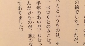
Take Japanese, for instance. There’s now upper/lowercase distinction in Japanese, and there’s no italic or bold. A number of conventions have developed instead. To give a quote or title, the Japanese would use half-brackets, 「like this」.  For emphasis, they would either alternate syllabaries (the language has two syllabaries that are used in concert), or use “emphasis points” (called bōten or wakiten) along the characters to be emphasized. This can be seen in the image below, a photograph from my copy of 星の王子さま (a.k.a. The Little Prince), where the characters けもの (beast) are being emphasized.

Page from The Little Prince - Japanese

All this is to say that different languages have different needs and have developed different ways to show paralinguistic distinctions. How we do things in our alphabet is not the only way! In a world where more and more languages are adopting the Roman alphabet, we should celebrate diversity where we still have it, shouldn’t we?

(Or maybe the real lesson here is that I have a bone to pick with everything!)